Friday, 30 April 2010

Final Animation


All the component and work from the project come together to form the final animation full animation and full colour in characters and backgrounds. Adjusting the compositing the lighting to really highlight the character, as well as adding shadowing.


The final film improved upon all the animatics before it and produced a film I'm proud. The rendering and looking over the movie for miner fault was very time consuming I had to re-render the move for the small animation error like a hand not being coloured and so on. The lighting on the film was a great successes abusing it to out line characters and moments. The camera angle could have been experimented with more to even more extremis. The warm colours through out the film work very well and with the blue colours on Lips make her seem like a race gem standing out as she dance through the environment. Although good work with my skill level I would have like to have more detail patterns on the characters outfit, but to animate that would have been far too time consuming.

Thursday, 25 March 2010

Update


After adding in line animation and discussing my film over with my tutor i updated my animation with cleaning up the after effects and some changes.

In shot 001 I adjusted the title with some sparks and moving my name to centre.

In shot 004 i shorten the fade out to black, also I made the backdrop full in behind Lips and added ropes to define it more clearly as a backdrop.

In shot 005 i shorten the hold before Lips slaps Gaze and again shorten the fade out. To this shot I will add some sound effects to the slap and clapping, for i see these moments in need of more high lighting.

In shot 009 I gave the kiss more time before the curtain closed on the characters and again added sparks to the “the end “ sign. final i also corrected the credits.

I will also add a few more sound effect and test to see if they work such as spark sounds for the title and “the end” signs. 

Wednesday, 17 March 2010

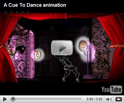
Animation video

This is the newest video of my animation with full animation. there is still some cleaning up and After Effecting to do to make everything look great and colouring the characters, but I'm happy with the animating i have done.  there is some few moments i have notice that need characters resizing, but if anything comes to mind let me know.

Tuesday, 23 February 2010

Film Chart


This is a full chart for my animation and the work i need to complete. with the time in sec:frames.

Wednesday, 3 February 2010

final Animatic

well this is the final animatic with keys. i will have to do a few more edits, but this is it give and take a few timing changes. once i have gone through it with a few people i will post up a list of any big changes if there any.

no sound on this copy getting it add this Friday to fit the video perfectly.  

Keys and Timing

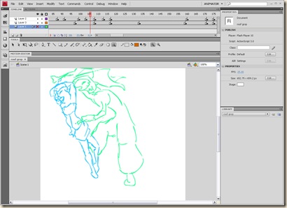
when  starting my keys i found it was much easier to read when i use a different coloured line for each character.

orange: GAZE

blue: LIPS

green: TAT

flash shot2 flash shot


when keying i Tieten up the timing witch is good as i was running over the 3:00 and was hoping that i had given to much time for some of the actions. it was nothing to much but a few frames here and there.

There was one bit of a shot i took out when looking it over and found it to be distracting and unneeded. The end of shot 005 where gaze is falling into depression and spots the LIPS like puppet. i was trying to make the point that he focuses to much on the body and he casts that off. I wasn’t happy that this didn’t read as i thought and i  felt a sad moment is less distracting and gets his emotions across better.

Compositing

compositing the background took some time, but it all worked out. I needed to rebuild the 3D layout in after effects to make it all work out in a way in witch I was happy. I simply placed the old animation in the set for now to get a good feel of the timing and depth the keys would have to be at for the next step.

below is a screen shot of where i add the new stage photos in with some masking, where i couldn’t Photoshop it cleanly, so there was a foreground and background layer of the stage. This was a bit tricky when i needed to animate the mask, but it all worked the way i planed. afefxlog_001

Below is a screen shot of a typical 3D layout for my shots with two stage layers,  backdrop layers and any characters seen in the shot, for some i would also add a camera. There are one or two pans and some other shots where the camera is needed to utilises the lighting set up. afefxlog_002

Lighting is very important i really want shadows and direction from the lighting to play a big part in the shots. i have add them where i believe they will give the desired effect, but until i have characters with the right colours i can’t tell for sure. From the test i have made i can’t see any big problems coming up.Untitled-1