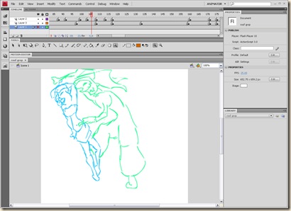
when starting my keys i found it was much easier to read when i use a different coloured line for each character.
orange: GAZE
blue: LIPS
green: TAT
when keying i Tieten up the timing witch is good as i was running over the 3:00 and was hoping that i had given to much time for some of the actions. it was nothing to much but a few frames here and there.
There was one bit of a shot i took out when looking it over and found it to be distracting and unneeded. The end of shot 005 where gaze is falling into depression and spots the LIPS like puppet. i was trying to make the point that he focuses to much on the body and he casts that off. I wasn’t happy that this didn’t read as i thought and i felt a sad moment is less distracting and gets his emotions across better.


No comments:
Post a Comment